

PORTFOLIO
Case Study
Our team partnered with LeoLabs to craft a compelling brand and marketing strategy that humanizes the company's advanced space technology and resonates with both commercial and federal clients. Recognizing that LeoLabs' team is driven by curiosity and a desire to contribute to something greater, the agency developed a brand voice emphasizing knowledge, curiosity, transparency, and inclusivity.
Key initiatives included:
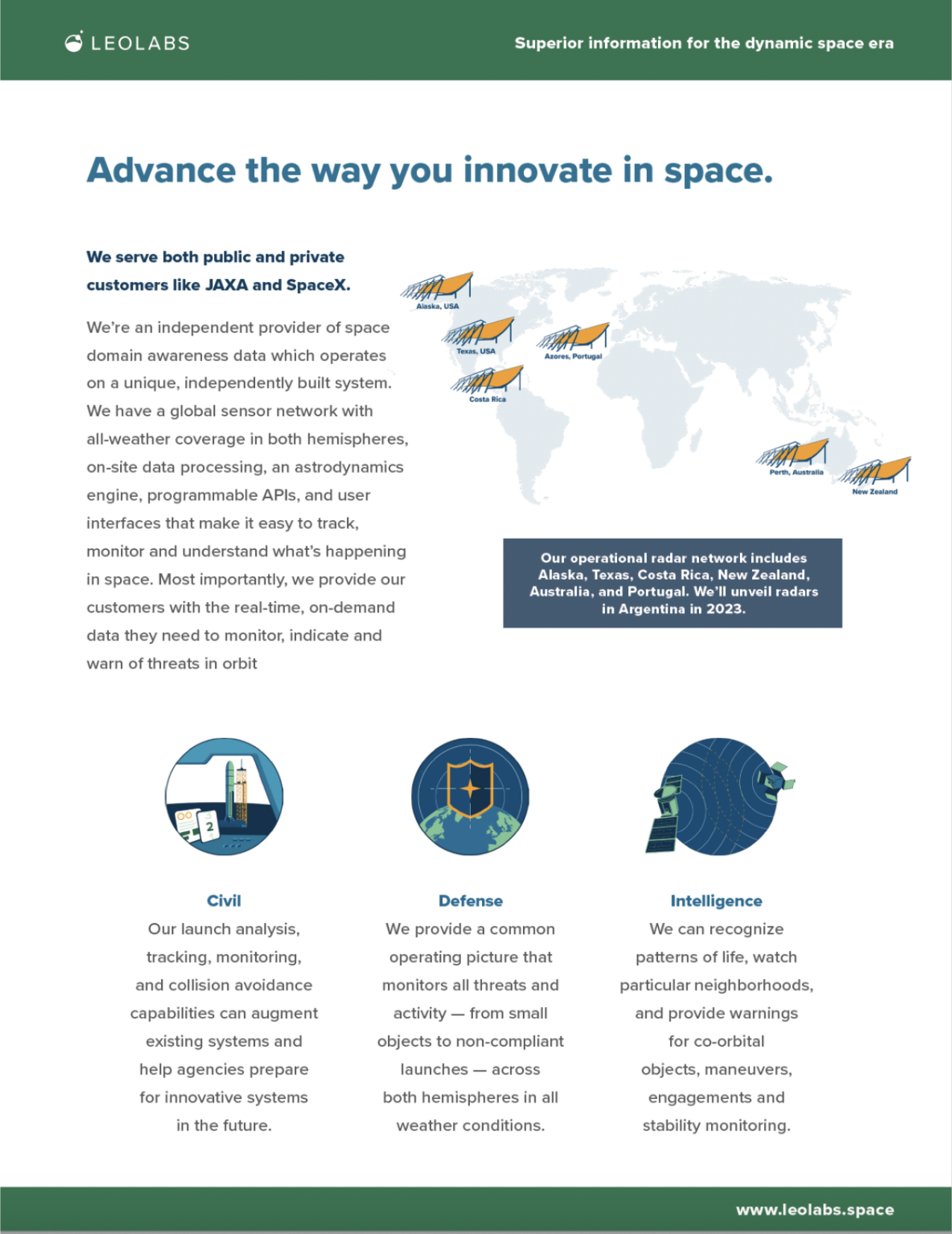
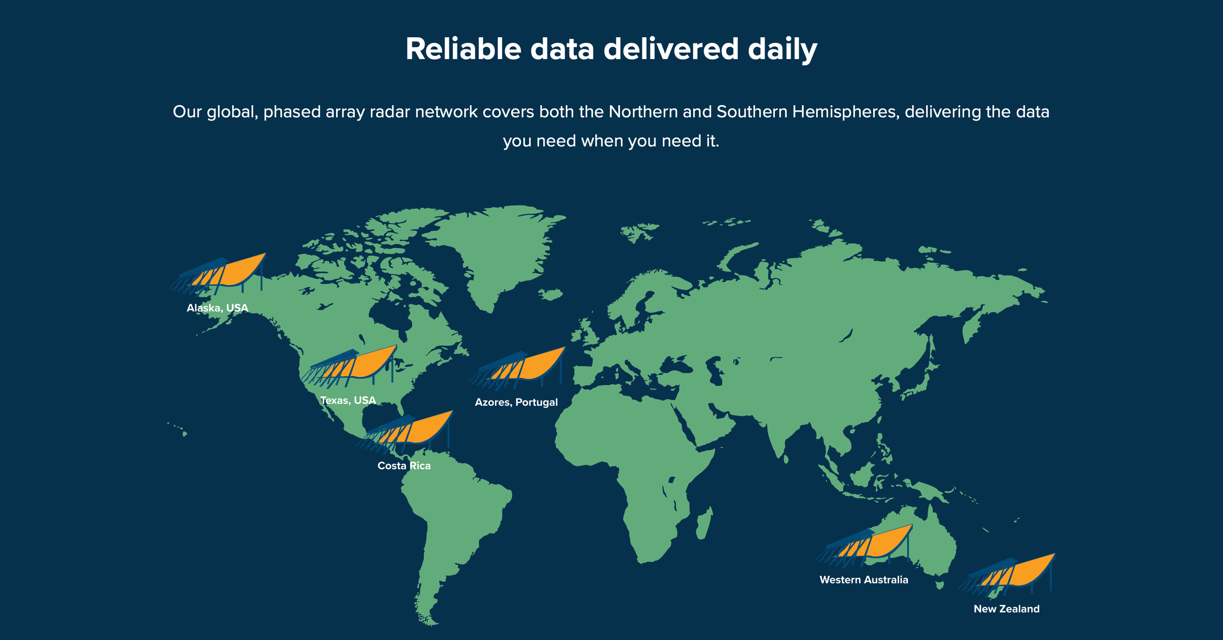
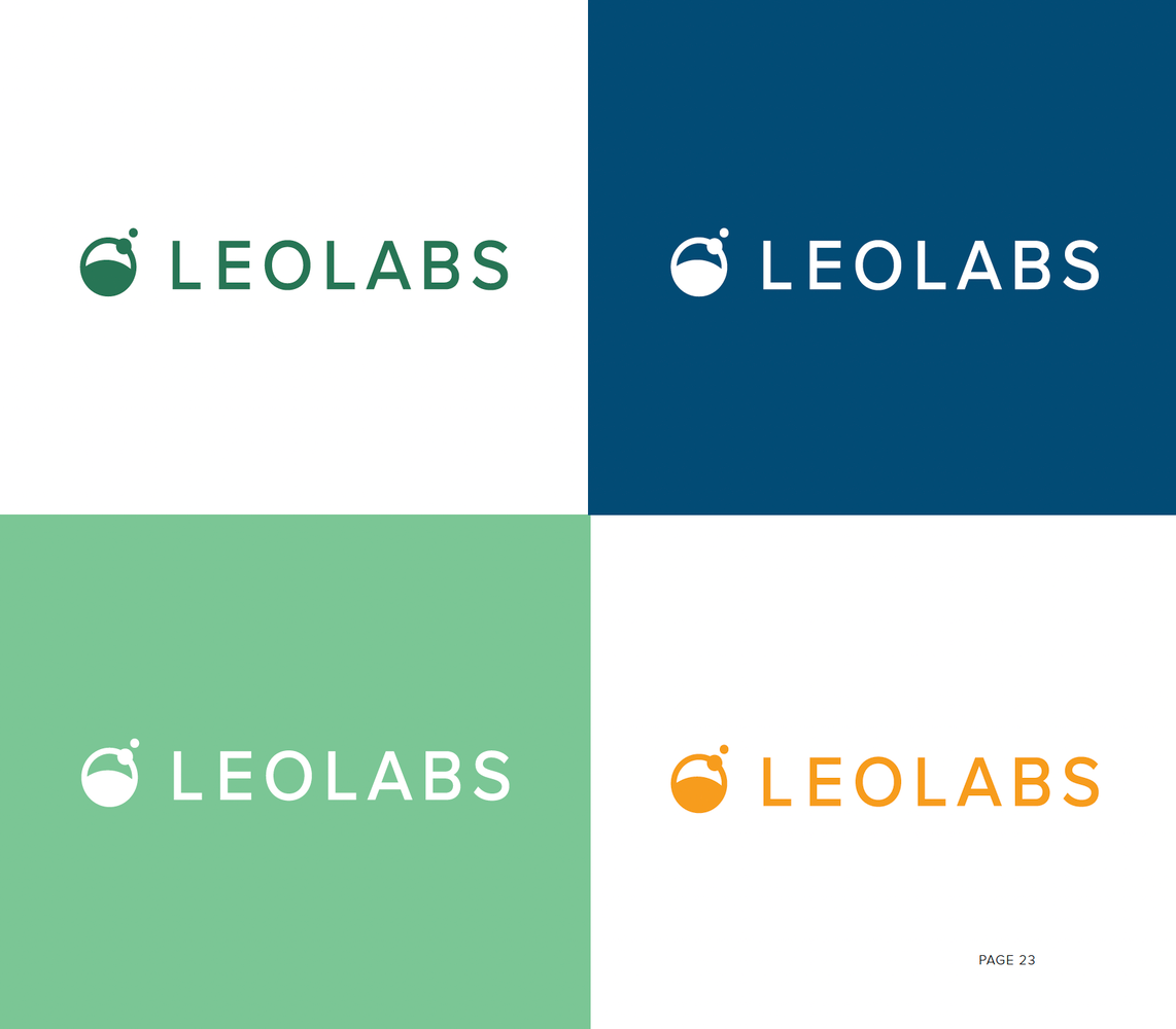
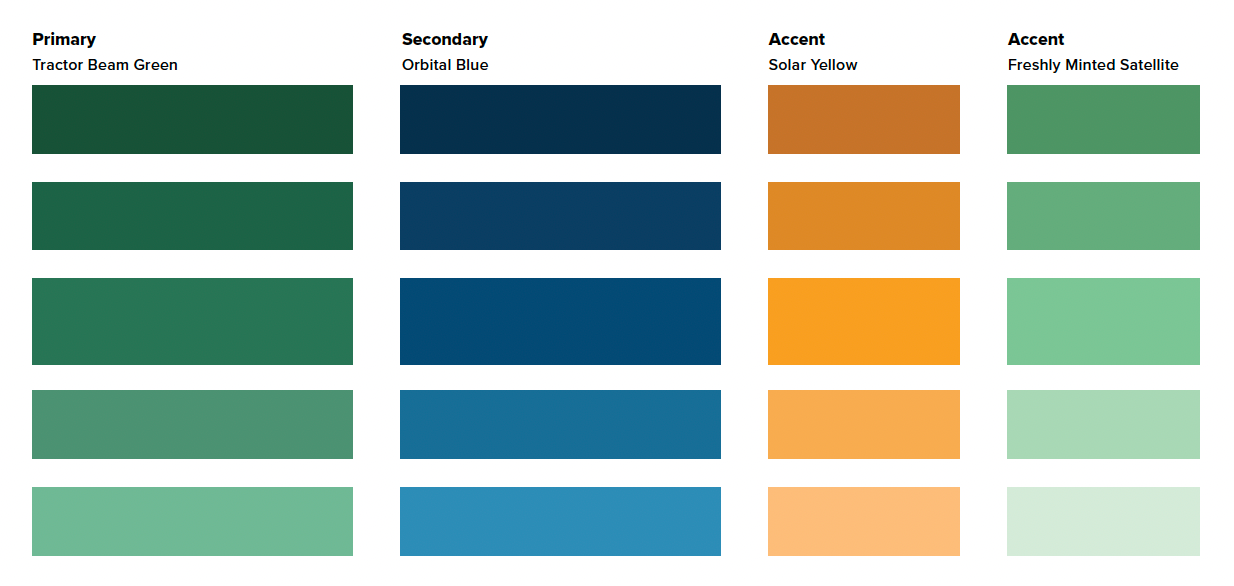
Brand Identity: Refreshed the existing logo and introduced a color palette featuring "Tractor Beam Green," "Orbital Blue," "Solar Yellow," and "Freshly Minted Satellite" to evoke sustainability and hope
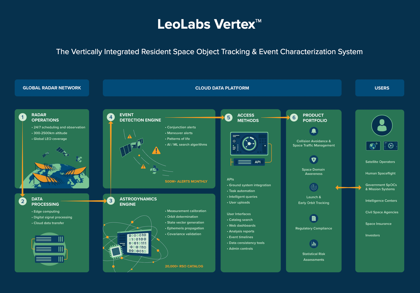
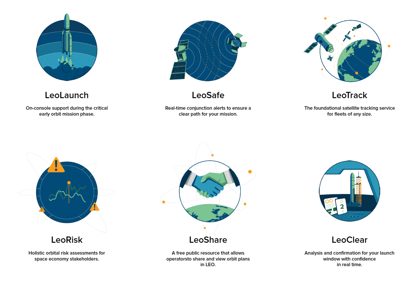
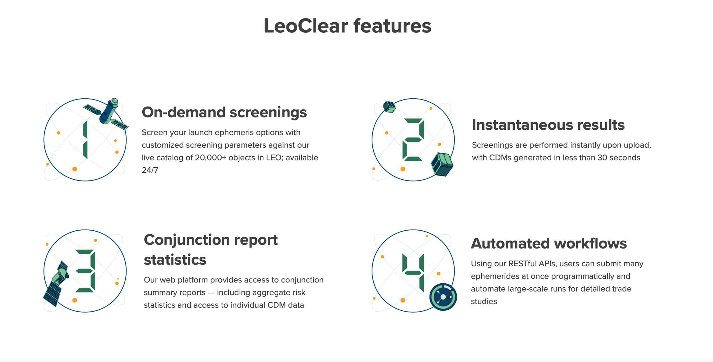
Product Naming: Established a consistent naming convention using the prefix "Leo" followed by a descriptive, one-syllable word (e.g., "LeoClear," "LeoSafe") to enhance brand recognition and product recall
Visual Communication: Developed simplified visual elements and iconography to represent complex aspects of LeoLabs' technology stack, making them accessible and engaging.
Thought Leadership: Launched a multimedia thought leadership program, including monthly deep-dive articles, mini audiobooks, infographics, and workshops, to position LeoLabs as an industry leader
Sales Enablement: Created a comprehensive suite of sales tools, such as presentations, one-pagers, webinars, and workshops, tailored to the needs of various customer segments
Outcomes:
Achieved a 450% month-over-month increase in organic website traffic from high-value targets
Secured over eight figures in new business from federal agencies
Recognized as a top vendor for the U.S. Department of Commerce’s TRACSS program


Case Study
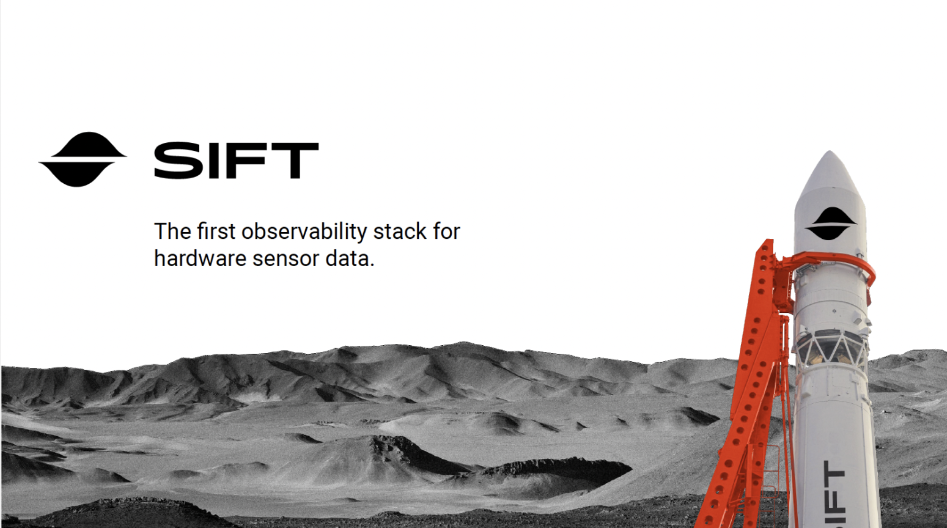
Launching toward Series A with machine observability startup Sift
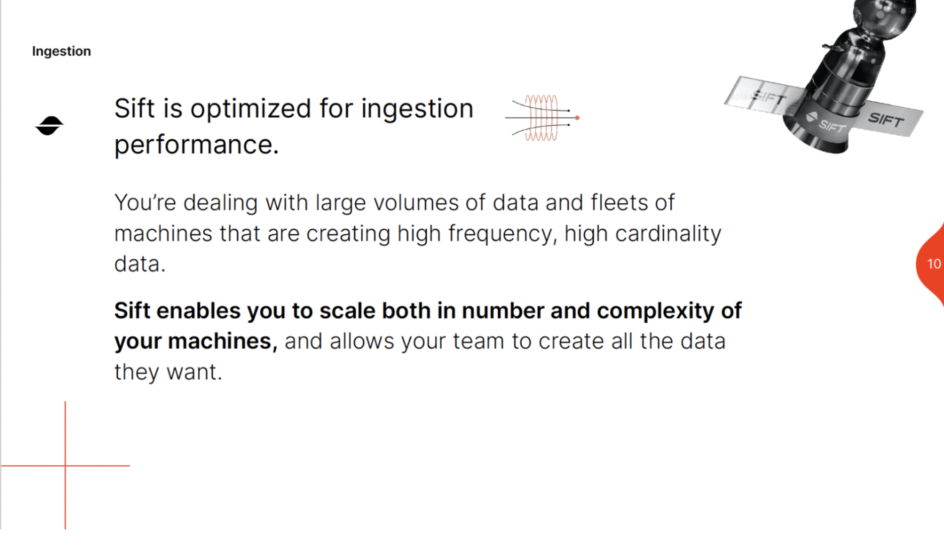
Sift, an emerging ex-SpaceX venture, delivers a powerful observability stack designed for machine builders working in industries such as aerospace, robotics, renewable transportation, and energy.
Still in its early growth stage, the company needed a demand-generation ecosystem and a robust sales enablement toolkit to capture the attention of both customers and investors. At the heart of Sift was a clear sense of purpose, an altruistic drive that shaped the foundation of the brand identity we developed to carry the company forward.
Key initiatives included:
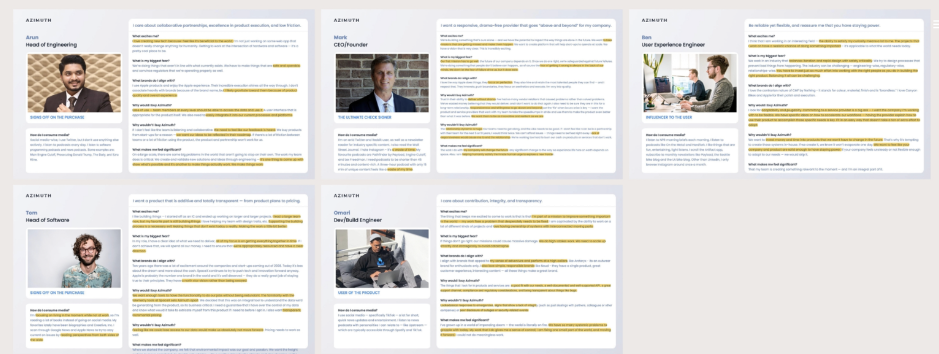
Conducting deep audience research through interviews with employees and target customers to uncover emotional motivations and connections. This informed a brand identity built on empathy and human connection.
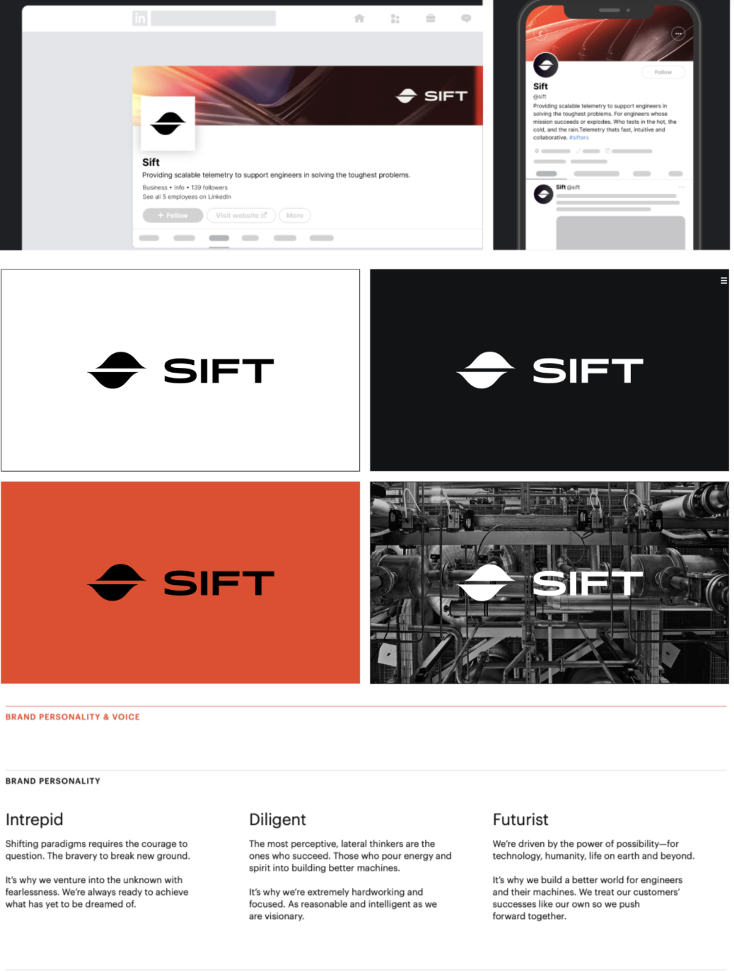
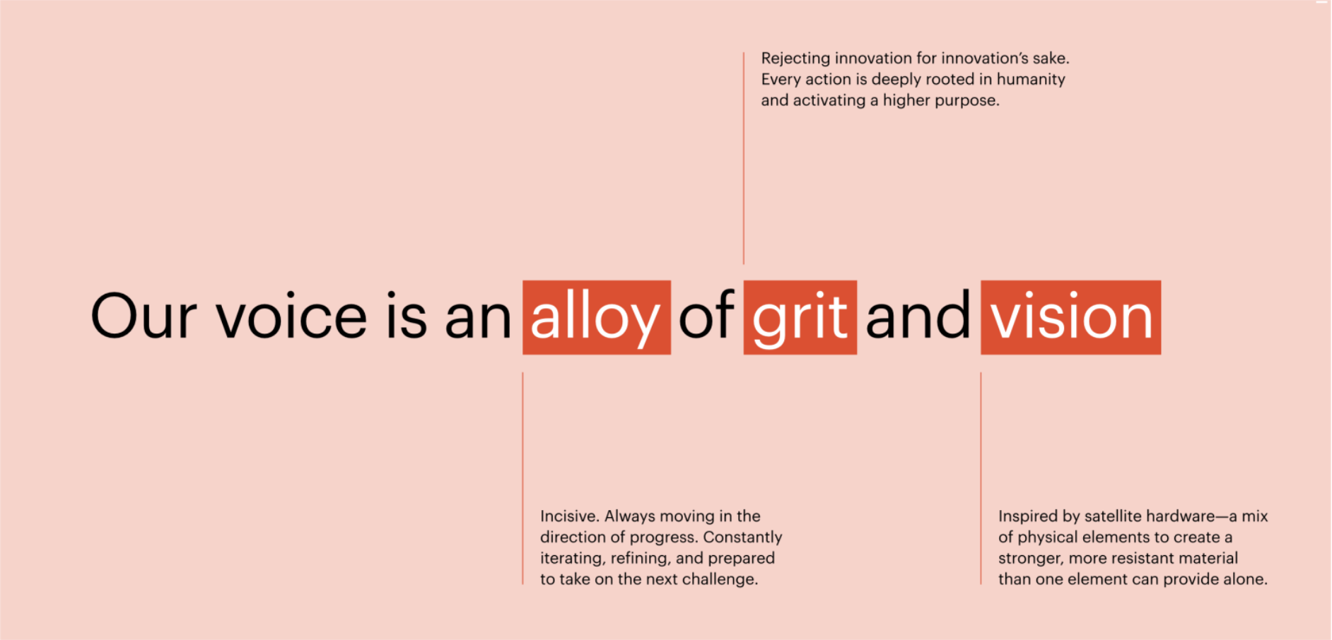
Developing Sift’s brand persona using a blend of the Sage and Outlaw archetypes, which shaped the voice, tone, and overall style. The voice was established to be optimistic, bold, authentic, and rooted in humanity while projecting both expertise and vision.
The visual identity drew inspiration from science and data, with a logo symbol based on connected data waves and a color palette centered on black and white with vermillion accents to represent clarity, passion, and innovation. Custom iconography and a grid system reinforced precision and dynamism.
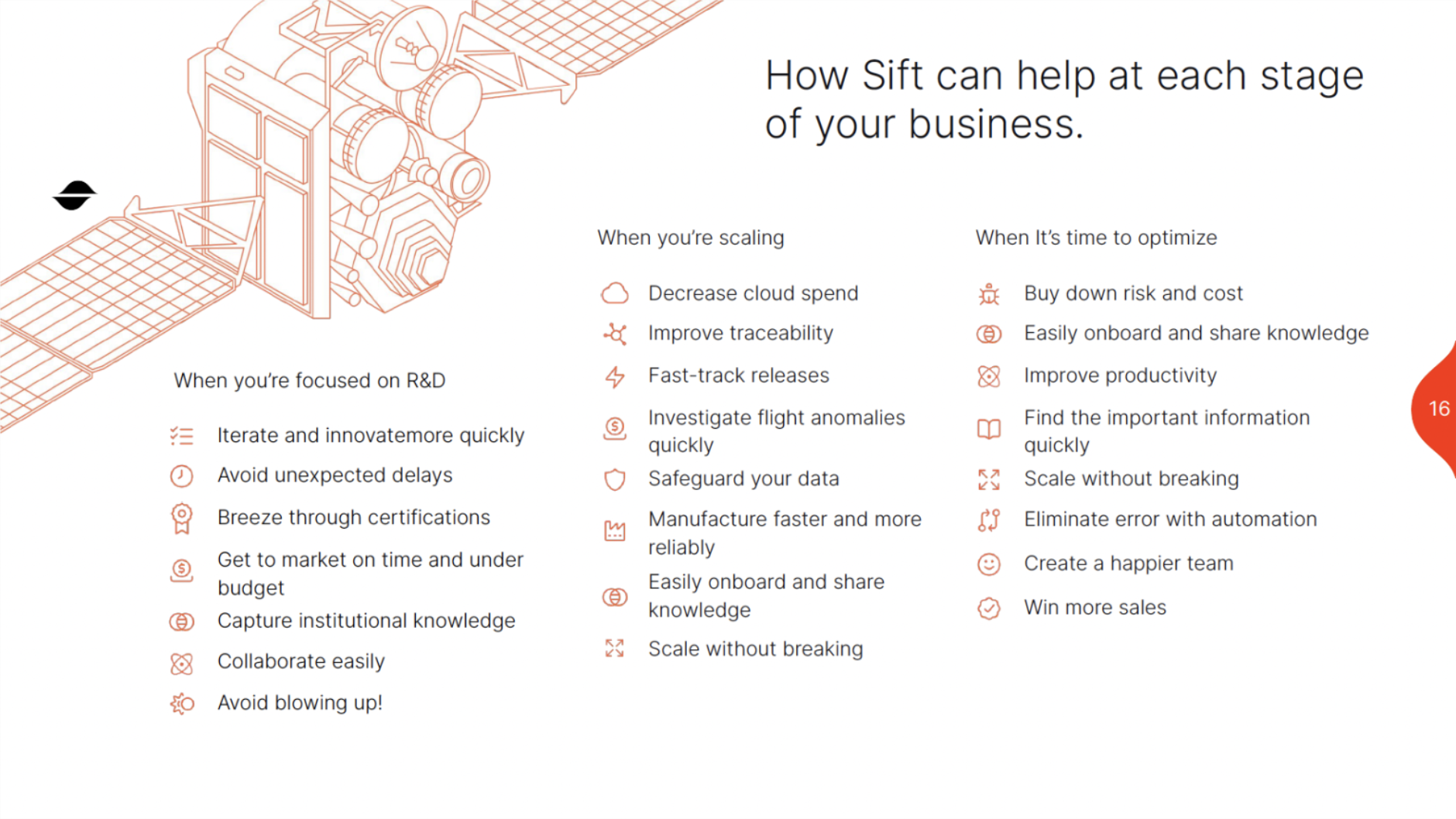
Simplified messaging to translate the complexity of Sift’s software stack into clear and memorable value statements for engineers and buyers. A cost-effective website was built to prioritize product education, thought leadership, and a seamless user journey.
Creating a visual product suite with branded iconography and simple animations to help customers remember each software layer. This was supported by a thought leadership blog, Mission Critical, that showcased the team’s insights in an authentic and technical voice.
A complete sales toolkit, including presentations, templates, one-pagers, videos, and a lead-scoring system, enabling the sales team to scale revenue from thousands into millions in annual recurring revenue.
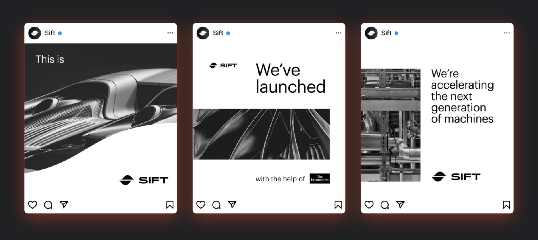
Executing a launch strategy that captured the attention of top publications such as the Economist, TechCrunch, and Payload, establishing Sift as one of the most exciting new players in deep tech.
Outcomes:
7-figure in revenue growth within the first year
Mentions and articles earned in top outlets globally
Achieved extention and Series A within the target time frame after launch


Brand Bible
A brand bible, also called a brand identity guide, is a document that defines the core elements of a company’s brand. It includes the visual and verbal standards that make a brand recognizable and consistent across every platform. This typically covers the logo, color palette, typography, imagery, tone of voice, and messaging pillars. It may also outline brand values, mission, and personality so that anyone creating content understands the brand’s character and purpose.
Its primary use is to ensure consistency. A brand bible acts as a reference point for internal teams, designers, writers, and external partners, making sure that all communication feels unified and aligned. This is a powerful tool in streamlining internal processes and creating a recognizable brand for target audiences.

